Show your (flag) colours
The BfC team has added flags to their profile pictures to emphasize that they are members and/or allies of the respective groups. The banner at the bottom of the image is the Progress Flag used by the LGBTIQNA* community. The banner in the top right corner of the image is the Disability Pride Flag, which represents the disabled community.
Table of Contents
Progress Flag
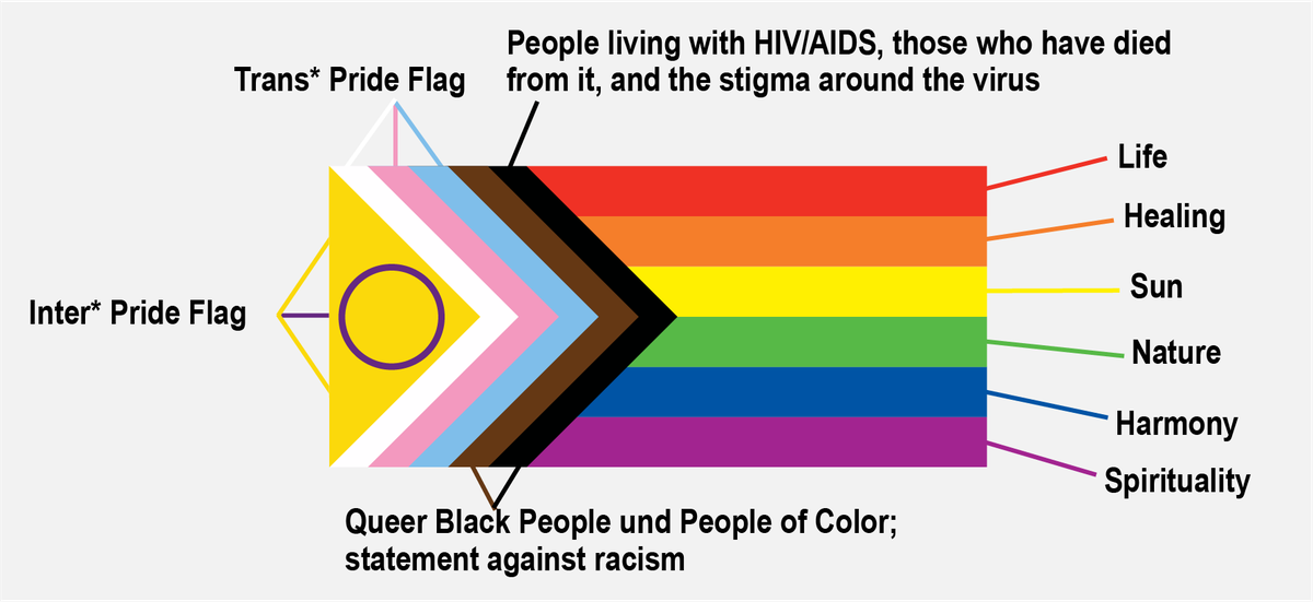
The Progress Flag is a further development of the flag, also known as the "rainbow flag." The latter was designed in 1978 to make a positive statement to the LGBTIQNA* community. It contains six horizontal stripes, with each colour representing a specific issue.
Over time, the flag has been adapted to represent individual groups. The Progress Flag was designed in 2017. In addition to the six horizontal stripes mentioned above, there is a wedge on the left with more colours (People of Colour, Trans* Pride Flag and Inter* Pride Flag) and a circle in the middle. The direction of the wedge pointing to the right symbolizes that progress has already been made. At the same time, there is still a lot of progress to be made in the future.
Due to ongoing adaptations and representation needs, there are now numerous different flags representing individual groups of the LGBTIQNA* community.
Explanations of other flags of the community (in German)
Disability Pride Flag
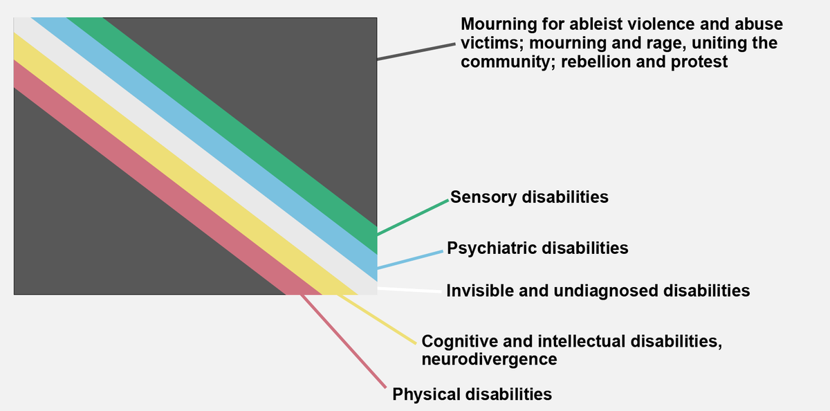
In 1990, the first Disability Pride Parade took place in Boston (USA). The purpose of the parade was to break down negative stigmas around disability and to highlight disability as a natural and enriching part of social life.
Similar to the Progress Flag, the Disability Pride Flag also features different coloured stripes with specific meanings (see image). The parallel arrangement of the stripes indicates solidarity within the community of disabled people. The course of the stripes through the picture diagonal symbolizes the breaking of barriers that separate disabled people. At the same time, the national flags of many countries include at least one of these colours, implying that national borders can be overcome through solidarity among disabled people. This gives the impression that creativity and light (white colour) "cut through" the darkness.
This metaphor was even stronger in an earlier version of the flag because the stripes were in the shape of lightning bolts. However, this version, which also contained brighter colours, should not be used anymore: Scrolling over it on electronic devices can cause strobe/flicker effects, which can trigger seizures, migraines, disorientation and other types of eye strain. The current version is designed to minimize these hazards and, by softening the colours, offers better perceptibility for people with, for example, red-green deficiencies.
You can download flags for the web or your own profile picture, as well as instructions on the intranet.