Meteograms
Meteograms from 1961 - 2024
Climate diagrams of the weather station of the research centre Jülich
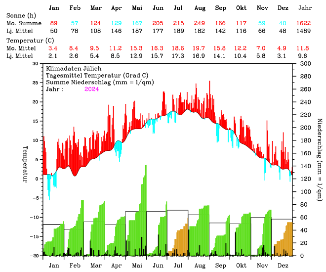
The meteograms show the main climate variables of a year at the climate station of Forschungszentrum Jülich. They contain the temperature deviations from the long-term average as well as the monthly precipitation totals in comparison to the long-term average monthly precipitation values. In addition, two tables supplement the graphical representation. They contain the monthly mean temperatures and the hours of sunshine compared to the long-term monthly averages. The mean values of the normal climate period from 1961 to 1990 are used for comparison.
Show meteogram


Meteogram description
Temperature curve
The upper half of the diagram shows the deviations of the daily mean temperatures from that of the long-term period. The black curve shows the course of the average daily mean temperature. For each day of a year, it is calculated by averaging the temperatures of the same days from all years in the comparison period. Days with a mean temperature higher than the long-term average are shown with red lines and cooler days are shown with blue lines. The lines start at the black line and end at the point of the daily mean temperature, which can be read off the left-hand diagram frame.
Precipitation
Precipitation is shown at the bottom of the diagram. The corresponding scale is plotted on the right-hand edge of the diagram. The individual daily totals are shown as black bars. The precipitation is summarised on a monthly basis and shown as monthly total curves. The area under the curve is coloured green if the monthly total exceeds the long-term average. If the total precipitation for a month remains below the mean value, the area is coloured beige. For comparison purposes, rectangles are drawn with the width of a month, the height of which indicates the long-term monthly precipitation sums.
Contact: Dr. Patrizia Ney